Legend
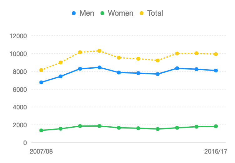
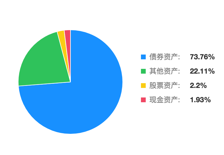
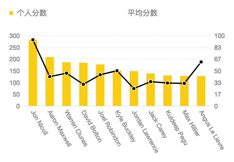
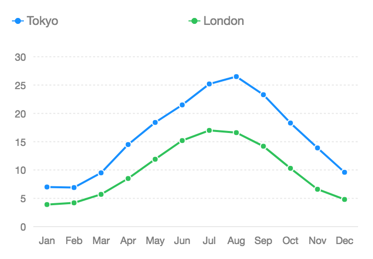
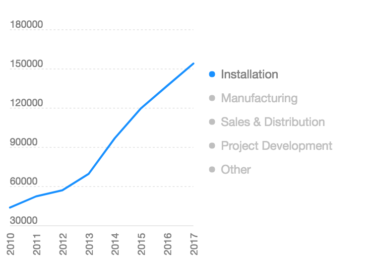
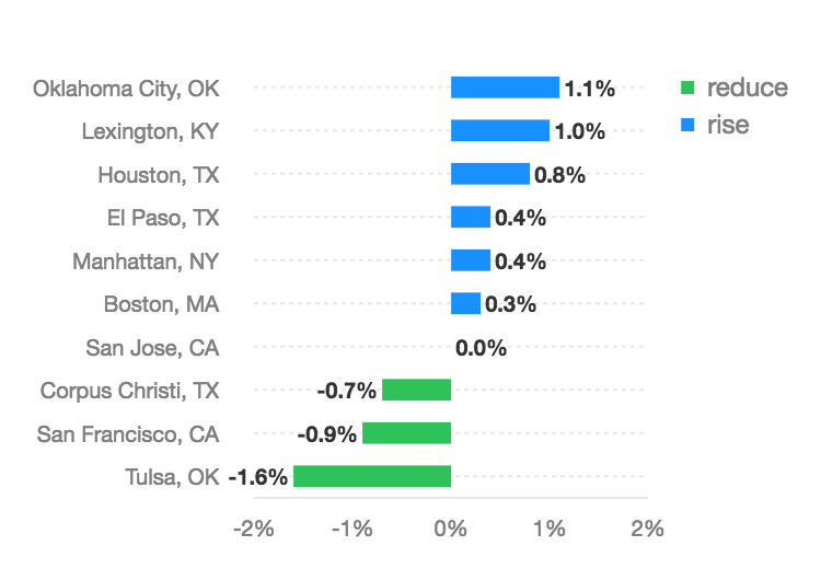
The legend for F2 is determined by the color mapping. When the data mapped to color is a cat scale(for discrete ordinal (ordered) or categorical (unordered) data), a legend is generated.

How to Register Legend Plugin
F2 has modular structure provides best tree-shaking results and package size optimization.
If you just import F2 from '@antv/f2', then it has included legend by default. But if you want a better package size optimization, you can register manually:
Legend Configuration
Close the Legend
chart.legend(false)
chart.legend(false)Just close all legends. Sometimes there will be several legends.
chart.legend(field, false)
chart.legend(field, false)field: String type, the map field of the legend.
Close the legend corresponding to the field.
Configure Legend
chart.legend(field, config)
chart.legend(field, config)field: String, the map field of the legend.config: Object type, configuration for the axis. The properties included are as follows:
Name
Type
Default
Description
position
String
'top'
The display position of the legend, can be set to 'top', 'right', 'bottom', 'left', defaults to 'top'.
align
String
'left'
It is used to set the alignment of the legend in the horizontal direction, when position is set to be 'top' or 'bottom'.The values that can be set are: 'left', 'center', 'right', and the default is 'left'. See demos.
verticalAlign
String
'middle'
It is used to set the alignment of the legend in the vertical direction, when position is set to 'left' and 'right'. The values that can be set are: 'top', 'middle', 'bottom', and the default is 'middle'. See demos.
itemWidth
Number | 'auto'
'auto'
It is used to set width of the legend item, defaults to 'auto', using the default layout of F2 to calculate the width. If the itemWidth is set to null, it will be calculated based on the width of the legend itself, developers are also allowed to set the value of the itemWidth, such as itemWidth: 50
showTitle
Boolean
false
wether show the title of the legend, default to false.
titleStyle
Object
{ fontSize: 12, fill: '#fff', textAlign: 'start', textBaseline: 'top' }
Configure the style of legend title. see Canvas for more details.
offsetX
Number
0
The offset of the legend in x direction. The value unit is 'px' and the default value is 0.
offsetY
Number
0
The offset of the legend in y direction. The value unit is 'px' and the default value is 0.
titleGap
Number
12
The distance between the title and the legend items, defaults to 12(px). If the title is not displayed, it is invalid.
itemGap
Number
12
The distance between legend's items in horizontal direction, defaults to 12(px).
itemMarginBottom
Number
12
The distance in the vertical direction from the next legend item, defaults to 12(px).
wordSpace
Number
6
The distance between the marker and legend label, defaults to 6(px).
unCheckStyle
Object
{ fill: '#bfbfbf'}
Used to set the style of the marker and text in the legend item that is not selected.
marker
String/Function/Object
'circle'
It is used to set the marker style of the legend, defaults to 'circle'. See custom marker for detail.
joinString
String
':'
Set the connection character for name and value in the legend item. The default is ':'.
triggerOn
String
'touchstart'
The trigger event of the legend filter behavior, the default is 'touchstart'.
selectedMode
String
'multiple'
Set the selected mode of the legend, provide two modes: 'multiple' and 'single'
clickable
Boolean
true
wether the legend is clickable, defaults to true.
onClick
Function
null
callback for clicking the legend, invalid when clickable is false. see here for detail.
custom
Boolean
false
when custom is true, users are allowed to customize legends, including the specific legends and corresponding interactions. The default value is false. See here for detail.
Legend align demos
align demosWhen position is set to be 'top' or 'bottom', you can set align property:
Legend verticalAlign demos
verticalAlign demosWhen position is set to be 'left' or 'right', you can set verticalAlign property:
itemFormatter callback
itemFormatter callbackUse this property to complete the formatted display of the legend item text. See detailed demo.
Custom maker
maker
The following describes the specific use of the marker:
When
markeris a String, F2 provides the following types:marker: 'circle'ormarker: 'square'when
markeris an Object, you can configure the type of marker and its style.
When marker is a Function, you can customize the shape you need
The following code draws a marker shown below:

onClick callback
onClick callbackSee demo.
Legend Item Interface
The Legend item implement the following interface,the image below will help you better understand:

For example, use the custom legend feature to define legend items as follows:

Custom Legend
You can use the custom legend feature to customize the display content and style of the legend, and you can also use the onClick callback to define the interaction behavior of the legend.
Below is a demo, you can click on the legend to control the display and hide of the corresponding geometry,Complete code.

More Legend Demos
Last updated
